
Screen Printing on Dark Fabrics: How Color Separation Keeps Colors Bright
Screen printing on dark fabric is a different job than screen printing on white or light-colored fabric. On a light shirt, the ink sits on top of the fabric and keeps its full brightness. On a dark shirt, the fabric color shows through translucent ink, so the printed image looks muddy and dull. Many garment printers quietly avoid dark colors for this reason. A design that looked bold on screen comes off the press looking faded.
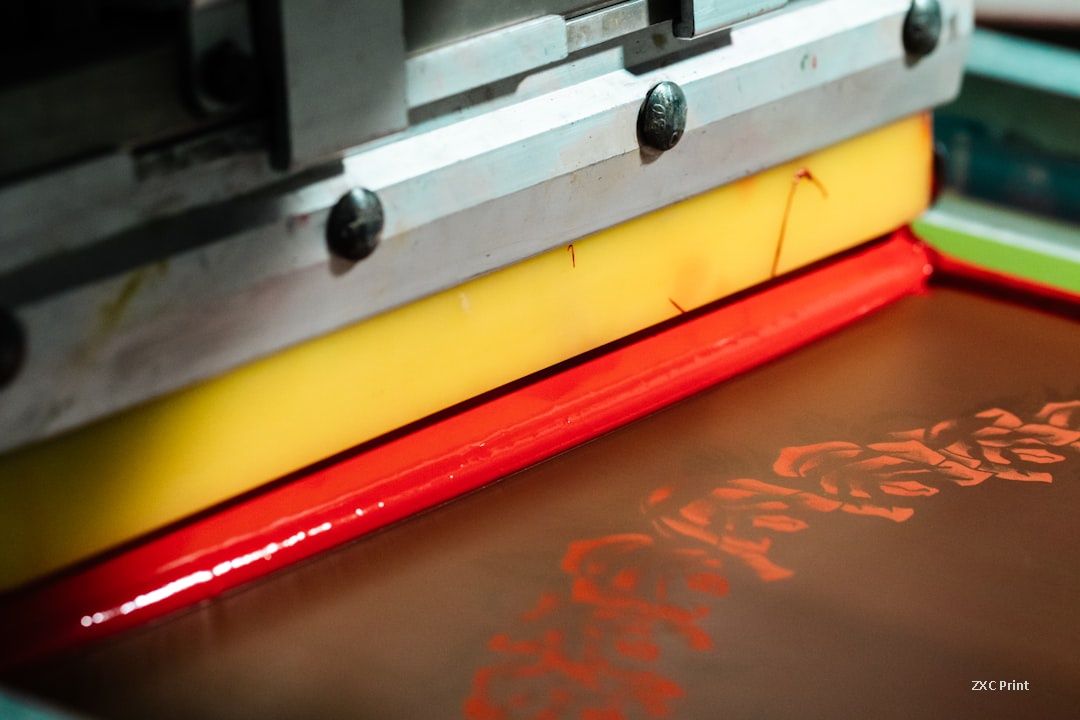
Screen printing remains a common production method for apparel and posters because it lays down thick, durable ink, but the dark-fabric problem is real. The fix is not in the printing itself. It is in the prepress work, specifically in color separation. The standard approach is to print a white underbase first, then print the design in spot colors instead of four-color process. That changes the whole file preparation workflow, and it starts with the original artwork.
Start with the right original
Before any separation work begins, check the artwork size and resolution against what the printer needs. Then look at the color model. Printers usually ask for CMYK files, but for separation work you want the RGB original. Once an image is converted to CMYK, a lot of color information is already gone, and converting back from CMYK gives you nothing to work with. Ask your design team for the untouched RGB file.
The base color of the artwork matters too. The background of the artwork should match the color of the fabric, or sit close to it. If the artwork has a white background but the shirt is black, the separation will be misleading. In a typical dark-garment job, the artwork base is black, matching the fabric.
Make the white underbase plate
The white underbase is the foundation of a dark-fabric print. Duplicate the image, convert the copy to grayscale, and invert it. Then adjust the curves so the white plate keeps the important tonal detail without introducing noise. The goal is a plate that blocks the fabric color where ink will sit, so the colors above it stay clean.
Build the spot color plates
Next, select one dominant color in the artwork with a color range tool. Save the selection as a new channel, read the RGB values of that dominant tone, and set the new channel's color to those same values. That channel becomes your first spot color screen. Repeat the process for the second-strongest color, then for the highlight areas and the shadow areas. In the channels panel you end up with the RGB channels plus four additional separation channels.
How many spot colors you need depends on the artwork. Bold, flat graphics might only need two or three. Detailed images with smooth tonal ranges need more. Each extra screen adds setup time and cost, so simpler designs are cheaper to print on dark fabric.
Soft proof before you cut film
Before any film is output, do a screen proof. Set one channel to the fabric color, in this case black, and paste the white plate into it. Turn all channels on and you can see an approximation of the final print. If the result looks wrong, pick different spot colors and rebuild the plates. With modern software you can also fine-tune individual channels.
What to check before sending files
Two things decide whether the finished print will look right. First, the printer must be able to mix every spot color you specify. If a separation calls for a color the shop cannot mix, the final result drifts. Second, separation quality still depends on experience. The person choosing the tones and setting the tolerance levels does work that software cannot fully automate. Ask your printer how many screens the design needs and confirm the spot colors before production.
Dark fabric printing rewards preparation. Deliver a clean RGB original, understand the screen count, and proof the separation before the press runs. The result is a print that keeps the design's brightness instead of losing it to the fabric.