
Print buyers, sales staff, and production people judge a printed job by different standards, yet they all use the same word: quality. A sheet that passes the press operator may fail the customer, and the opposite happens as well. The reason is that color judgment depends on conditions, such as the light in the room or the surface the sheet sits on. That is why evaluation rules and standard viewing conditions exist. When everyone looks at the print under the same light source, arguments about color turn into something closer to a fair test.
Color Difference Appears at Three Levels
In practice, color difference is divided into three types.
The first is difference from the original. Reproducing the tones of the original is the whole purpose of color printing. The closer a print comes to the original, the better the job, and a print that can be mistaken for the original represents the highest level of subjective quality.
The second type is within-batch difference: the color error between sheets of the same run, measured at the same position of the same color area. Some variation is normal because ink feed, paper moisture, and plate wear all shift during a run, but large swings make the product look uncontrolled.
The third is between-batch difference: the error between different production runs of the same product. If every batch is slightly different, customers who put old and new stock side by side will feel that the product has aged, and they may start to doubt whether the goods inside are as consistent as the packaging outside. Once that doubt appears, the brand suffers, and the print buyer hears about it from the factory.
Color Tolerance Sets the Acceptable Limit
Both customers and printers would like the color error to be zero. In real production that goal is unreachable, because too many variables act on the ink film while it transfers and dries. The practical answer is color tolerance: the amount of difference the customer accepts between the print and the original or the approved proof. Quality control then has a clear target: hold every sheet inside that agreed range instead of chasing an impossible perfect match.
Subjective Evaluation: The Eye as the Judge
The most direct method of checking printed color is visual comparison. The press operator or the quality inspector looks at the sheet against the original or the approved proof and decides whether the copy is faithful. Fidelity means how well the print reproduces the tone scale of the original, and it is the daily working standard on press.
When no original exists for comparison, the quality of the print is judged by how natural it looks. People carry memory colors for familiar objects: skin tones, green grass, blue sky, or the red of a common label. If the main subject of a print disagrees with what most viewers remember, the job will not be accepted as a high-quality reproduction. In short, the subjective standard for printed color is that it looks true, natural, and harmonious, with small adjustments allowed for customer intent or the way the product will be used.
What Counts as the Original Keeps Changing
In the past, most originals were photographic slides, prints, and hand-painted artwork. During color separation and proofing, staying close to the original was treated as effective reproduction, and a proof that matched the original by about 90 percent was generally accepted by printers.
Digital workflows have widened the definition. A customer who sees a color on a calibrated monitor or a desktop proof often treats that image as the original, even if it differs from the file the prepress house started with. Every color reproduction system, whether a monitor, a desktop printer, or an offset press, has its own color gamut, so some colors in an original simply cannot be reproduced in print. Roles also shift along the chain: the photographer treats the real scene as the original, the separator treats the photo as the original, and the printer follows the approved proof.
Objective Evaluation Puts Numbers on Quality
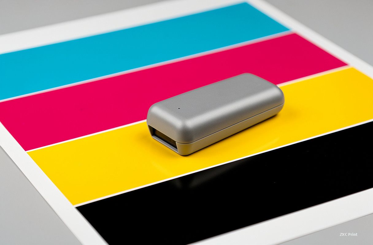
Subjective judgment varies from person to person, so the industry also evaluates color objectively: subjective impressions are translated into physical quantities through statistics, giving a standardized scale that removes personal bias. Objective methods rely on measuring instruments and on control elements printed together with the image, such as solid ink patches, dot gain bars, and gray balance strips. Only when quality is expressed in numbers can print control become automatic.
Measurement Drives Production Control
Consistent color depends on measuring each step of production. Sampling sheets during the run is the key habit: the press crew pulls prints at set intervals, measures the control patches, and spots drift while it is still small. Early correction prevents wasted sheets and keeps the job inside tolerance.
Density has long been the main parameter for judging printed color, since it tracks ink film thickness closely. But density says little about hue, so the industry is moving toward CIE Lab colorimetric values, which describe lightness, red-green position, and yellow-blue position in a way that matches human vision. Using Lab values makes it possible to describe the color itself instead of only how much ink sits on the sheet.
Every stage of the workflow needs recorded data and a measuring tool; without them, errors multiply quietly. Modern color management systems tie the scanner, monitor, proof, and press together with profiles, so checking and correcting color is faster and more consistent than the old trial-and-error method.